DynamoAI / Design SystemsShipped
Driving Design Token Adoption with 91.9% Codebase Coverage
Executive Summary
As DynamoAI scaled its product portfolio, we faced growing UI inconsistency across platforms, impacting both user trust and developer efficiency. This work highlights how we conducted a iterative and scalable token system overhaul, reducing visual drift, improving design-to-development workflows and achieving over 90% migration adoption across code and design.
My Role
I was responsible for leading the design token system migration, defining the token architecture, and developing automation scripts for auditing and semantic mapping. I facilitated cross-functional alignment between design and engineering teams through workshops and documentation.
As Dynamo grew and rapidly shipped new features, visual inconsistencies started creeping into our products. With designers and engineers working at different speeds, and with varied approaches, UI elements across products began to look and behave differently.
This inconsistency wasn't just aesthetic. Customers trialing our products side by side started noticing the lack of visual cohesion, raising concerns about familiarity, usability, and overall product quality.
Internally, we struggled with design handoff clarity and inconsistent implementation making both design to development translation vague and error-prone.
The Challenge
It became clear: we needed to address this foundational inconsistency head-on. Before thinking about solutions, we had to first understand the scale and root causes of the problem.
Our initial audit showed that while UI components and design patterns were relatively stable, the inconsistency lay at the primitive level: colors, spacing, and typography tokens.

In Design Files
Token usage lacked semantic clarity and was not purpose-driven. Designers frequently created one-off color definitions without a consistent rationale, often leading to multiple redundant tokens representing the same visual intent across different parts of the UI.

In Codebase
Colors existed in multiple formats like hex, rgba, Tailwind classes and are spread across .tsx, .jsx, and .scss files, with no clear mapping to UI intent. There is a high usage of tailwind colors because of the base component that we used which is shadcn.


Our first step was to understand how colors were being used across the design and codebase, and whether each token had a clear purpose or intent.
To bring structure and clarity, we conducted a thematic analysis of all color instances. Using an affinity diagramming approach, we grouped colors by usage context and visual role. This helped us establish a more meaningful and hierarchical token structure, ensuring that each token served a distinct, purpose-driven function within the UI.

We established a two-layer token structure to bring clarity and consistency.
Base Tokens (Primitives)
These include all foundational color shades used across our system. Given that most of our existing codebase already relied on Tailwind color definitions, we chose Tailwind as our primitive language. This decision helped ensure:
- • Ease of reference: Designers and developers could quickly map colors without reinventing naming conventions
- • Resource efficiency: With limited time and no dedicated color science team, Tailwind gave us a practical, scalable starting point
- • Fallback flexibility: Tailwind offered a wide enough palette for cases where we lacked custom brand colors (like purple or lime)
Semantic Tokens
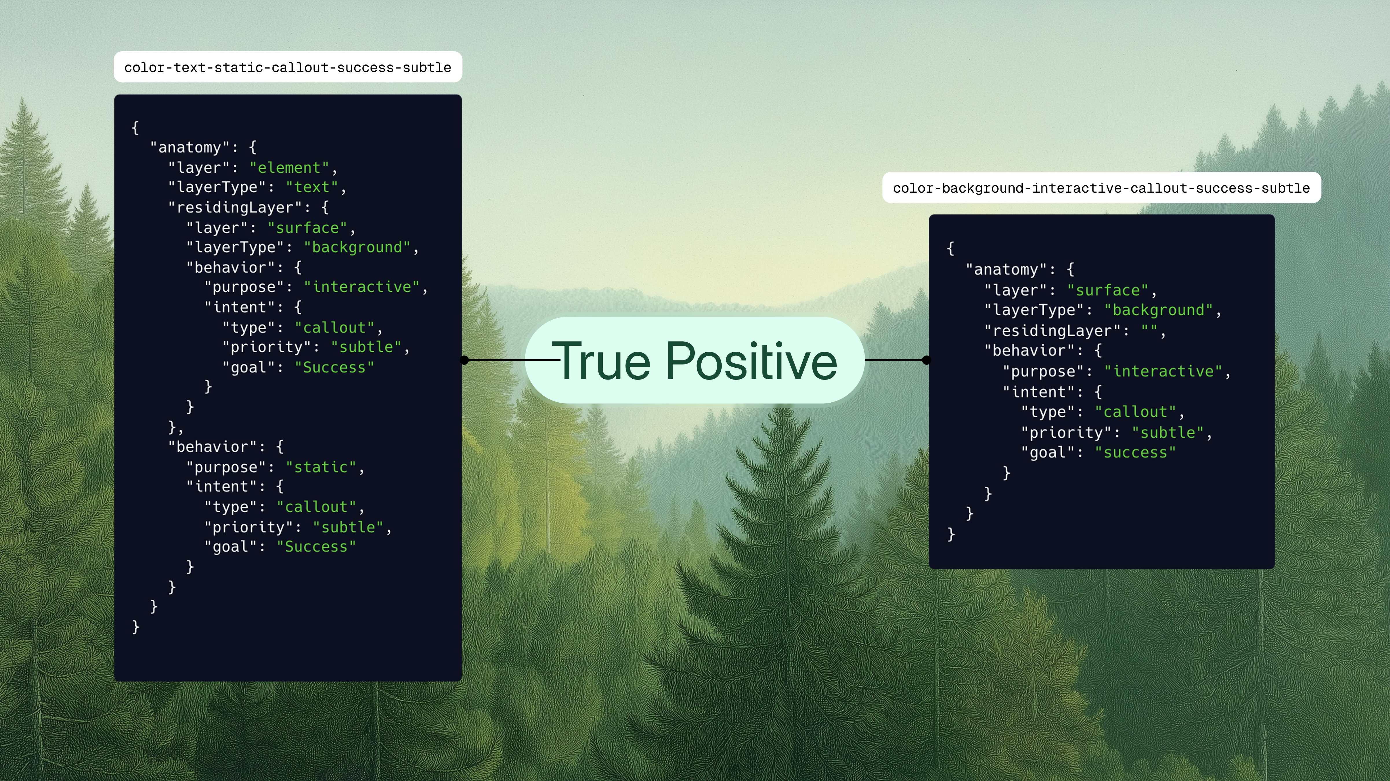
Built on top of primitives, semantic tokens reflect where and why a color appears in the UI such as success states, alerts, or neutral backgrounds. This layer ensures tokens carry purpose-driven meaning, improving design intent clarity and implementation consistency. To define semantic tokens effectively, we framed them around three guiding questions:
- • Where does it live? Identifying the UI component or layout area where the token will apply.
- • What is the contextual purpose? Understanding the role the color plays in user experience (e.g., alert, success, background).
- • How much should it grab attention? This helps guide tone, contrast, and visual weight for each token.

So color token naming will be like:

We focused on making the new token system adoptable without disrupting ongoing development.
For Designers
We started small by applying the new tokens to upcoming features. A dedicated Figma workshop and in-file documentation helped designers get comfortable with the system.
For Developers
To support backward compatibility and phased adoption, we needed a structured migration plan. Our existing codebase had colors in various formats: hex, rgba, Tailwind classes, and inline styles, scattered across .tsx, .jsx, and .css files.
Migration Script Development
To support developers during the migration, I built an executable script that scanned the entire codebase to identify all color definitions. This not only gave us a comprehensive inventory of colors in a structured JSON format but also laid the groundwork for semantic mapping in the later phases of our migration.

| Script Support | |
|---|---|
Normal className strings | ✅ |
Template literals inside className | ✅ |
Inline styles (color, border, background fields) | ✅ |
Pseudo-classes (hover, focus, etc.) | ✅ |
And also, the script intent such as interactive or static detection based on element, event handlers and pseudoclass.
Phase One: Primitive Migration
We kicked off Phase One of the migration by converting all raw color values into our base (primitive) tokens, using Tailwind colors as the foundation. The conversion was handled through the Chroma.js package, which helped us find the closest Tailwind match for each color.
To ensure accuracy, we logged all mappings into JSON and CSV files, allowing us to validate and review any potential color deviations during the process.
With every color now mapped to a primitive token, we started seeing the first signs of consistency across the codebase. This set the stage for Phase Two: Semantic Migration.

Phase Two: Semantic Migration
We began by creating a reference semantic mapping list to guide the conversion. Design tokens were exported from Figma as a JSON object using the Variable2CSS plugin, making it easier to align each color with its closest Tailwind match.
Through multiple iterations and logic refinements, we fine-tuned the mapping process. After several validation cycles, we successfully crossed our target threshold—achieving over 90% of tokens aligned to semantic definitions.


Phase 1: Manual Design Handoff Review
- • Token reviews: Token reviews are now a standard part of design spec review sessions before implementation, helping us systematically catch mismatches early.
- • PR Review Integration: Designers actively participate in developer PR reviews to validate correct token usage before merge.
- • Storybook Integration: We're adding token references to our Storybook, providing developers with a single source of truth during development.
Phase 2: Scaling with Tooling Support
- • Figma Plugin (In Progress): A custom plugin that lets designers self-audit token usage before submitting designs for review.
- • Figma Code Connect (Exploration): We're exploring this to further bridge design and development workflows, making token translation seamless in future phases.
- Deep Codebase Familiarity Matters: For any visual revamp or refresh, an in-depth understanding of the codebase structure and setup is critical. It ensures your audit focuses on how the codebase actually supports the problem you're solving.
- Start Small, Scale Gradually: When working with large, scattered codebases, start with a single sample file. This makes debugging easier and helps catch issues early before attempting larger refactors.
- Leverage Contextual Metadata: We added a classification key in our audit JSON output to tag the type of HTML element using each style. This helped us narrow down component-specific patterns quickly and target them more effectively during migration.
Next Project